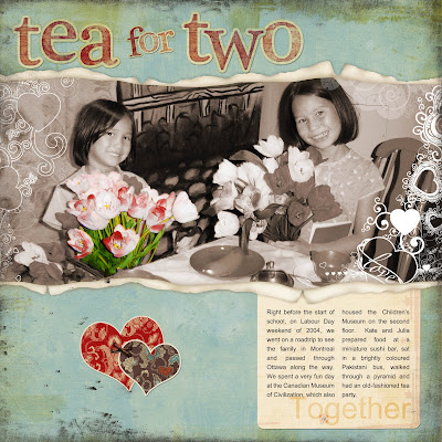
 I've started Jessica Sprague's new intermediate-level course for digital scrapbookers, "Now We're Rocking with Photoshop", and here is the Assignment 1 layout. The photo is from our visit a few years ago to the Children's Museum in Ottawa. I love that museum! You've got to go if you have young kids!
In Assignment 1, we learned how to use an adjustment layer to create a sepia-toned image over the original one and to use the eraser tool to remove parts of the overlay, thus "recolouring" the image. The layout design is by Jessica Sprague and uses lots of elements, including a distressed-edge overlay. I just can't do "grungy" without copying someone else's layout. Fortunately, Jessica does grungy so well.
Here are the other credits. Background and journalling papers and grungy-edged frame: Trish Jones. Torn paper template: Katie Pertiet. Alphabet: Meredith Fenwick. Heart embellishment: Jessica Sprague. Valentine brushes: Jason Gaylor.

No comments:
Post a Comment